Kristie Chu 2026
Let’s stay connected! :)
Oregon Software Consulting
Redesigning club website with UX research to improve user experience and enhance outreach to attract more clients
Project Overview
Oregon Software Consultants (OSC) is a student-led organization focused on uniting skilled students to collaborate on software development projects.
Our goal is to redesign our club website that helps streamline the application process for new members and make it easier for users to seek our services. We have made it through our ideation phase and are currently in our prototype phase. My role in the project involved refining the user experience and interface design.
Timeline
October 2024 - March 2025
Role
UI Designer
Team
Project Lead / UXUI Designer: Mary Pham
Web Developer: Drew Moulton
Tools
Figma
FigJam
Procreate
The Problem
Our goal was to enhance the club’s website and outreach methods to increase retention rates, while also branding ourselves so students, orgs, and clients know who we are.
Some questions we had were:
What do students look for when they join a club?
What information and features do they expect to find that would make them more compelled to join a club?
Why would a client pick us, and what do we need on website to attract more clients?
Why redesign the website?
Despite initial interest, we saw a 40% drop in member retention, largely due to a weak online presence. Students struggled to find clear information about our structure, while clients lacked confidence in our services due to vague and cluttered content. A website redesign is essential to build trust, improve clarity, and boost engagement from both members and clients.
Gathering Data
We started off the research process with a survey and student/client interviews in which we asked questions that helped us understand how students and potential clients currently find and evaluate OSC. We then synthesized our results through graphs and affinity maps.
Through this research, we identified three key areas of focus:
Discoverability: Students need to easily find the club and its website.
Club Information: Students want quick access to OSC’s location, values, and member benefits.
Client Information: Potential clients want to understand services offered, pricing, and the quality of OSC’s work.
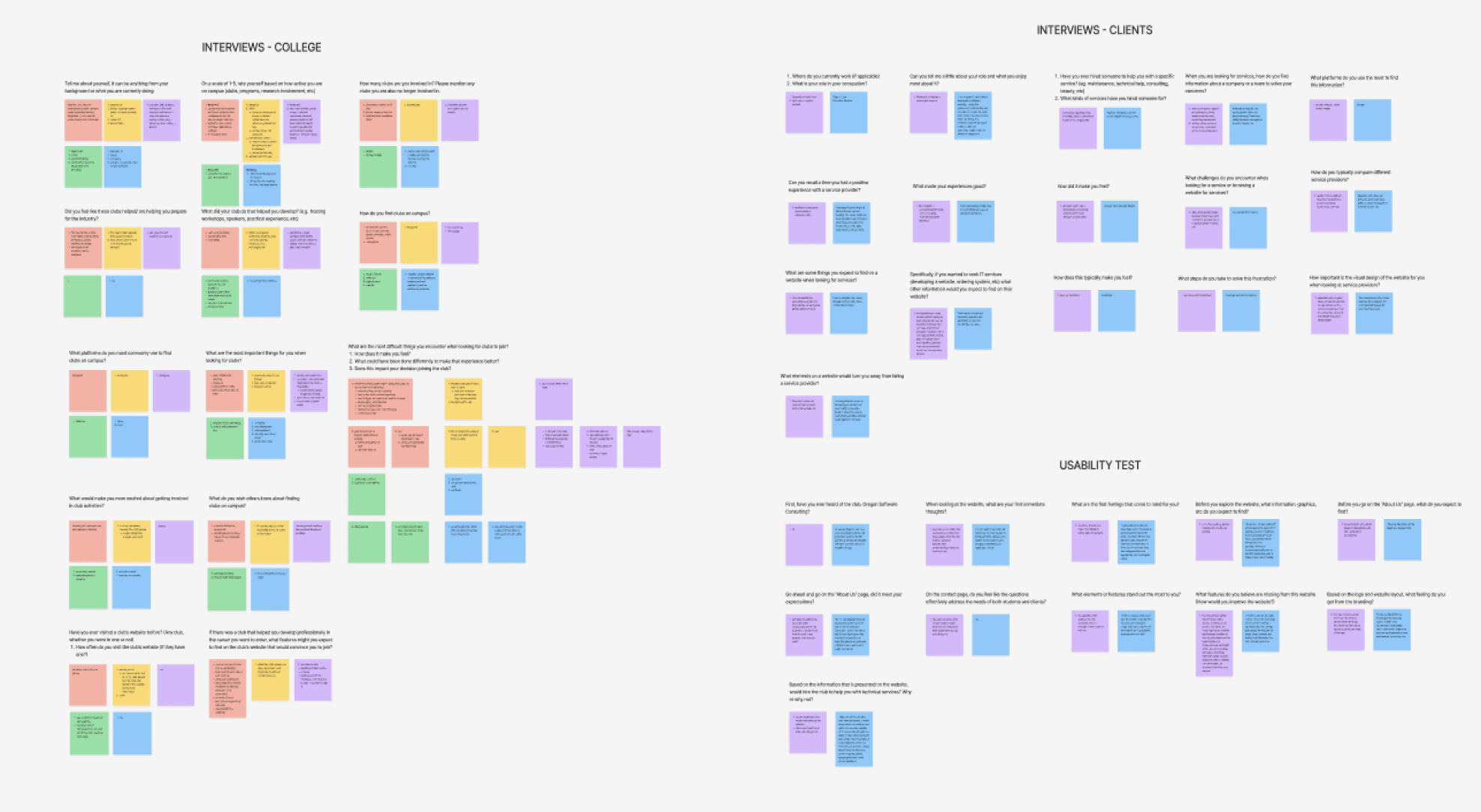
Student / Client Interview Answers

Initial Survey Results From College Students
The User
We went into the project with two audiences in mind: students looking to join OSC and clients looking for design services. Through our research, we identified the different information each audience needs to quickly understand whether OSC is right for them.


The Journey
To better understand the experience from our users’ perspective, we mapped out the key steps, needs, and pain points they may encounter when interacting with OSC. This helped us identify opportunities to make important information easier to find and create a more seamless path through the website.


Competitive Analysis
We also analyzed similar student organizations and design groups to see how they structured their websites, presented their services, and showcased their work. This helped us identify common patterns and opportunities to improve OSC’s website experience.

Exploring Solutions
With our research insights in mind, we began exploring different ways to address the needs of both students and clients. We brainstormed ideas, organized the site’s information architecture, and developed wireframes to explore how these solutions could translate into the website experience.
Brain Dump & Info Architecture
We created a brain dump of possible features and content to include on the website. From there, we organized these ideas into an information architecture, mapping out the site’s structure and how its content could be organized across different pages.

Brain Dump

Information Architecture
Mid-Frame Prototypes
Using our information architecture, we created mid-fidelity wireframes to explore the layout, content hierarchy, and navigation of the website before moving into the final design.

Feedback (Usability Test)
We shared our wireframes with interviewees and gathered feedback on the structure, content, and overall experience. We organized their responses into sticky notes to identify common feedback and areas for improvement.

Final Design
With our research, feedback, and iterations in mind, we brought our ideas together in the final website design. The redesign focused on creating a clearer, more organized experience for both students interested in joining OSC and clients looking for design services.


Reflection
This was my first full UX/UI project, and it gave me the opportunity to experience the design process from research and ideation to wireframing, feedback, and final design. Through the project, I learned how to turn user needs into a more organized and informative website experience. We ultimately revamped OSC’s website to make it easier for prospective members and clients to find the information they need and understand what the organization has to offer.

