Project Overview
Timeline
Role
Tools
Team
For this project, my team and I collaborated with the client to enhance their existing site by refining the user interface. The goal was to create a more fresh and inviting look by incorporating more white space and complementary colors. As the supporting UI designer, my main tasks were to redesign the contact page, create correlating components, design cards on the homepage, and redesign the footer.
Bags of Love is an organization dedicated to helping children in need by providing essential items and comfort during challenging times.
Why did we redesign the website?
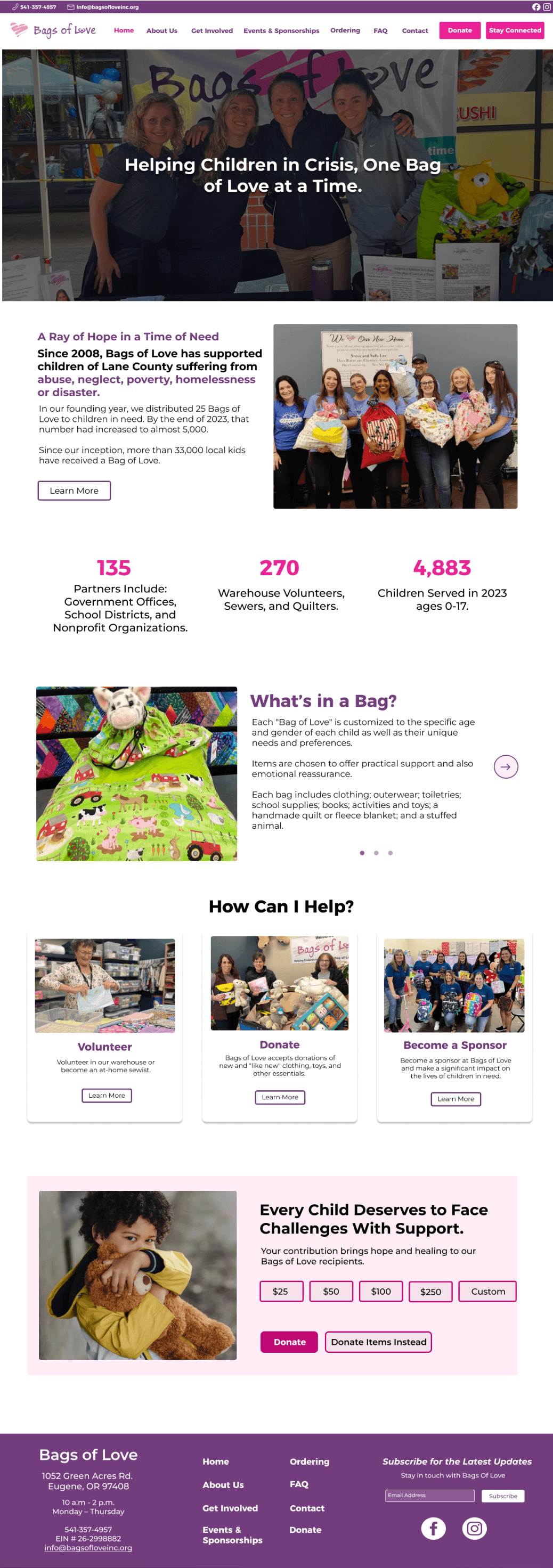
The client wanted a website rebrand that refreshed the color palette while maintaining the brand’s signature pink and purple hues. The existing design felt too dark, making it less inviting and accessible. They sought a lighter, more modern look to improve the overall user experience.
Previous Website


What was the approach for this project?
Due to time constraints, we were not actually able to conduct user research. Instead, we gathered all the information and needs the client had and placed it into one document. Then, we went onto the prototyping phase to start our design based on the *requirements*.
Here is a quick layout of our design process within a limited timeframe:
Brainstorm / Discussions with Team
Wireframes (lo-fi -> mid-fi -> hi-fi)
Enhancing Engagement: Donations & Volunteer Sign-Ups
Because Bags of Love entirely relies on volunteers and donations, one of our main focuses were on these aspects of the website.
A donate button was added on the nav bar and bottom section for easy access.
Cards were utilized for the volunteer and donate section for users interested in becoming a volunteer or donating.
Stats were included on the home page to show the impact of Bags of Love on the Eugene community.
New Website - Home Page
We improved the contact form for a smoother user experience and added key organization details, making it easier for users to reach out and find essential information.
We also included an interactive map so users can easily locate the Bags of Love building.
New Website - Contact Page

Improving contact information and accessibility
The original footer color didn’t fully align with the rest of the website’s visual identity. The components also felt disorganized, which made the section harder to scan and navigate. Additionally, the newsletter area displayed the entire newsletter, making it difficult for users to quickly identify the most important information at first glance.
We optimized the footer by adding more links to key pages, making it easier for users to access key information and resources. We included a section for users to subscribe for updates, and moved the newsletter to another part of the website for better accessibility.
Footer Prototypes


Version 1
Old Footer
Version 2
Final Version
Redesigning the footer


Bags of Love
Redesigning a website for a fresh, updated look and improved usability
March - June
UI Designer
Canva
MS Word


Lead UI Designer: Mary Pham
Web Developer: Drew Moulton
UI Design Kit
#723C7D
#EA2096
#5A2A63
#8D5A97
#FFECF7
#BF0873
Aa
Aa
Montserrat
Montserrat
First and Last Name
Name *
Samantha Brown
Name *
|
Name *
First and Last Name
Name *
Contact Form Text Box
Contact Form Check Box
Reflection
Through this first web design project, I deepened my understanding of UX/UI principles while strengthening my Figma skills by creating both wireframes and high-fidelity mockups. I experimented with multiple color palettes to refine the site’s visual identity and analyzed comparable designs for inspiration. I also built interactive buttons in Figma to better simulate the user experience for the client. Most importantly, the project reinforced that starting, even without having everything figured out, is what sparks creativity and allows ideas to evolve!
How did our final design align with what the client expectations?
We redesigned the website with a refined color palette that introduced more white space while preserving the brand identity. The updated design enhances readability, creates a more welcoming feel, and aligns with the client’s vision for a refreshed yet familiar look.
Let’s stay connected! :)
Kristie Chu 2025